
UI + UX DESIGN
NxStage Navigation Redesign
Accessibility in Action: Redesigning a Navigation for All
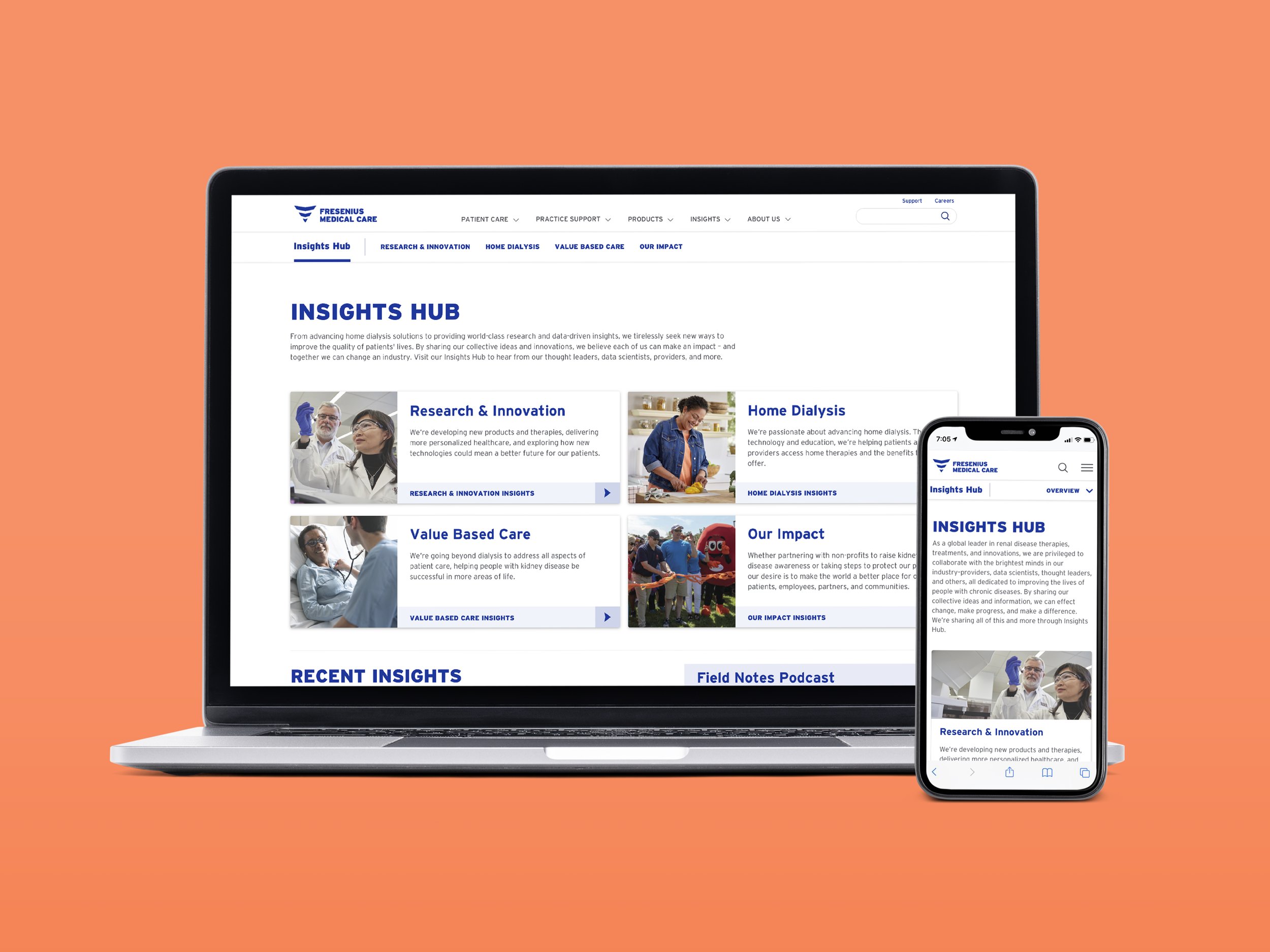
Context
NxStage Medical’s website underwent a usability study in 2021 to gauge how the website performs across a range of different audience types. One of the areas examined was the main navigation.
The News & Insights section – initially created to be the central hub for healthcare news – was flagged for significant usability issues relating to:
Nomenclature - filters and sorting options caused confusion and a lack of interest in the content.
Navigation - users failed to locate deeper-level content due to the lack of clarity around the categorization of content.
Audience - the content was lacking appropriate and valuable filters, making the intended audience of the News & Insights unclear.
Role
UI/UX Design, Art Direction, Copy Collaboration, Development Coordination, User Acceptance Testing (UAT)
Solution 1: Optimize Category Nomenclature & Improve Discovery
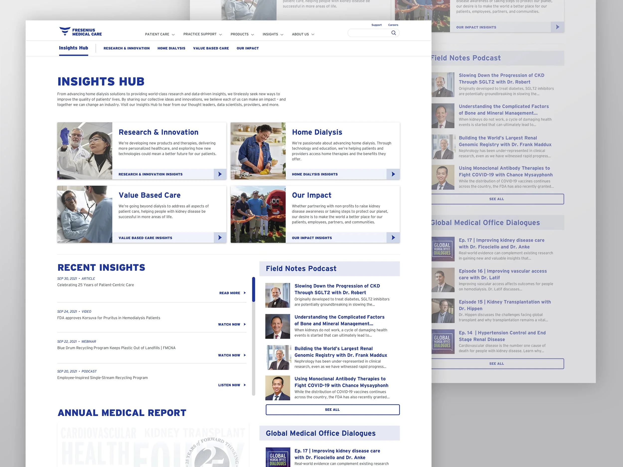
Users failed to locate deeper-level content due to the lack of clarity around the categorization of content.
By categorizing the insights hub content into four buckets, or sub hubs, the user could access these sub hubs via the 2-up cards at the top of the page. Additionally, I added secondary navigation to allow users to flow from one sub hub to another based on the content they wanted.
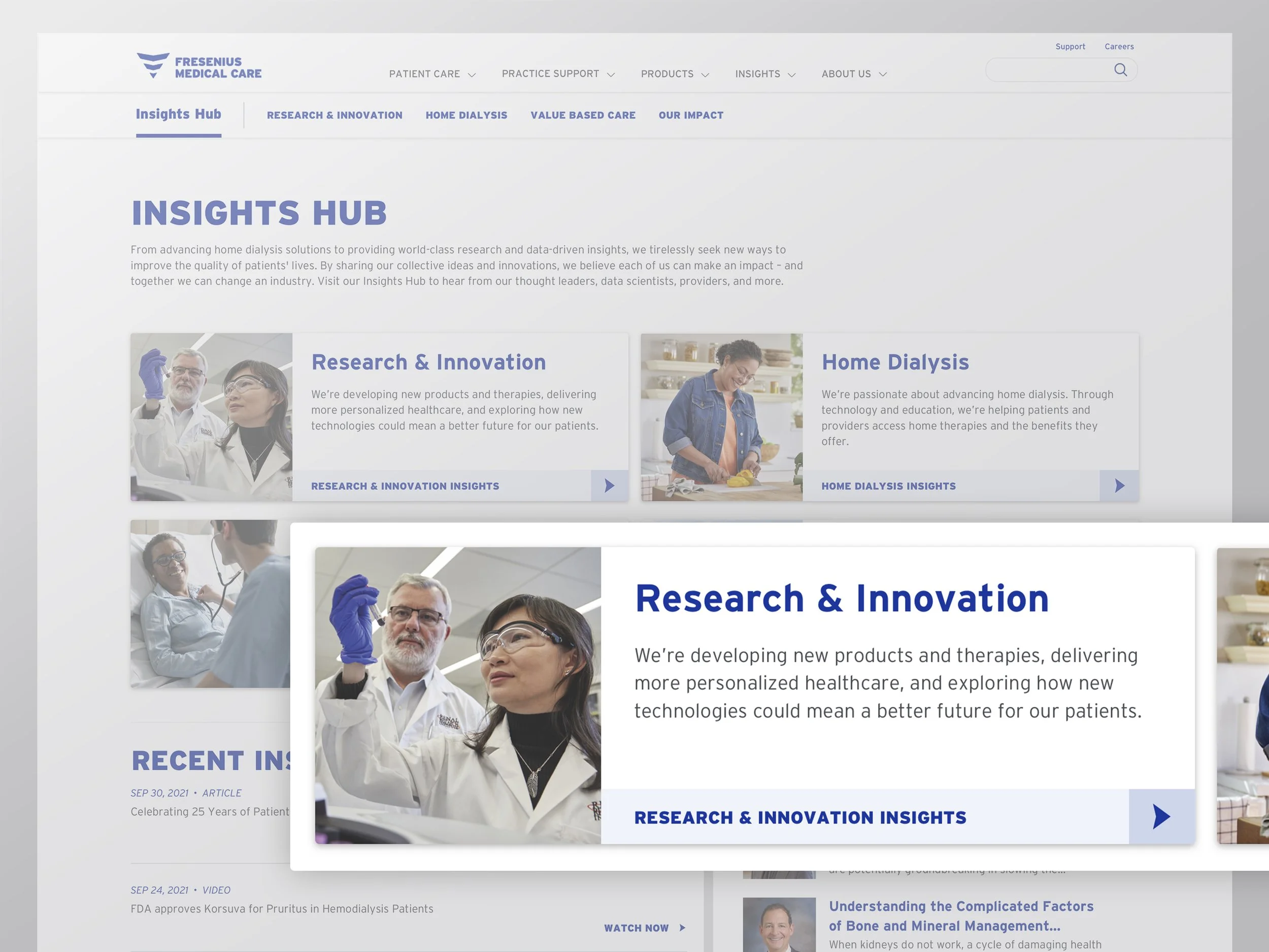
For additional clarity, I worked with the content team to include a summary under the title of each sub hub card. The overview was added to orient the user by previewing the content they should expect to find in each sub hub before being redirected to it.
Let’s Rewind a Bit.
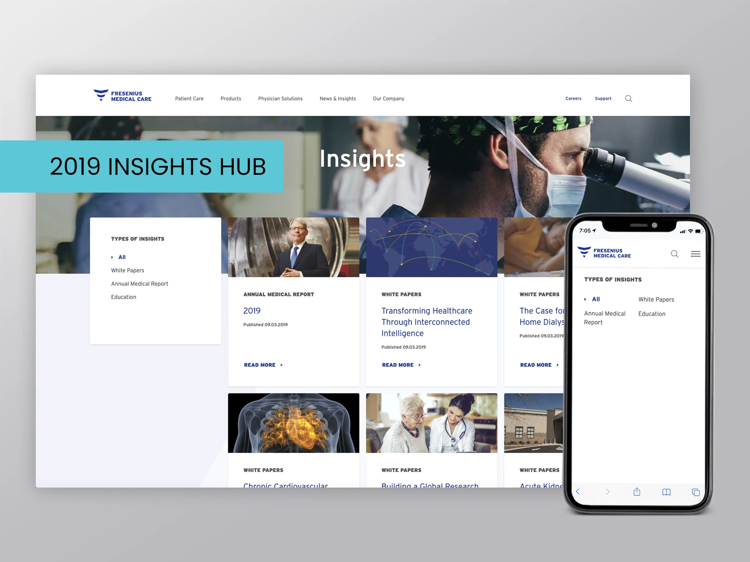
Figure 1. The former Insights Hub (2019)
The former Insights Hub (2019). The first thing observed was the critical need for filtering and sorting functions, a defined audience, and intuitive nomenclature. The mobile filters were not following UX best practices for many reasons. Still, the most significant challenge users were facing was a full-screen filtering menu on mobile screens with no intuitive way to get back to the overview page. Additionally, “Apply” and “Clear” functionalities were missing.
Cut to: Solution 2
I gave each sub-hub a filtering menu to refine content by media types, such as articles and podcasts, and various topics within each hub. The SEO team provided relevant filters for me to include, and I then worked with the content management team to add tags based on these filters to all of our media on the back end.
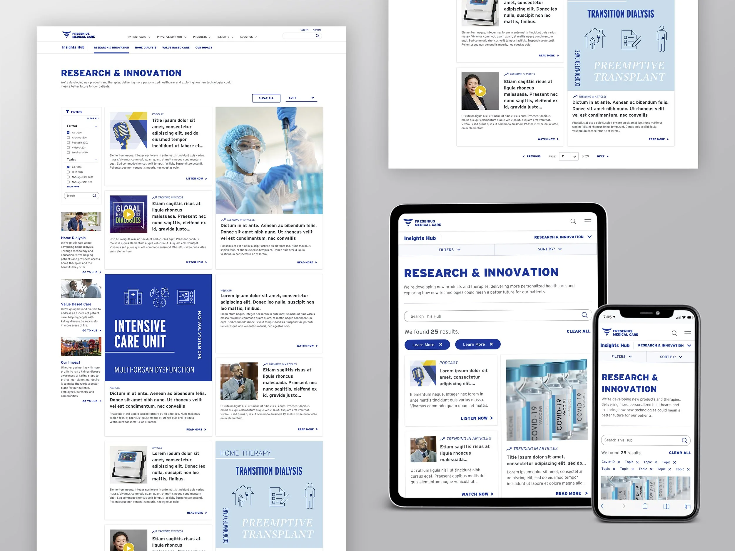
I had the opportunity to bring new sorting and filtering functionality to the Insights Hub that would eventually apply to many other areas of the FMCNA website.
I wanted to alleviate the frustration our audience noted during the usability study of not finding what they were looking for quickly. So I implemented search functionality into the filtering menu so that users could investigate topics that weren't already available.
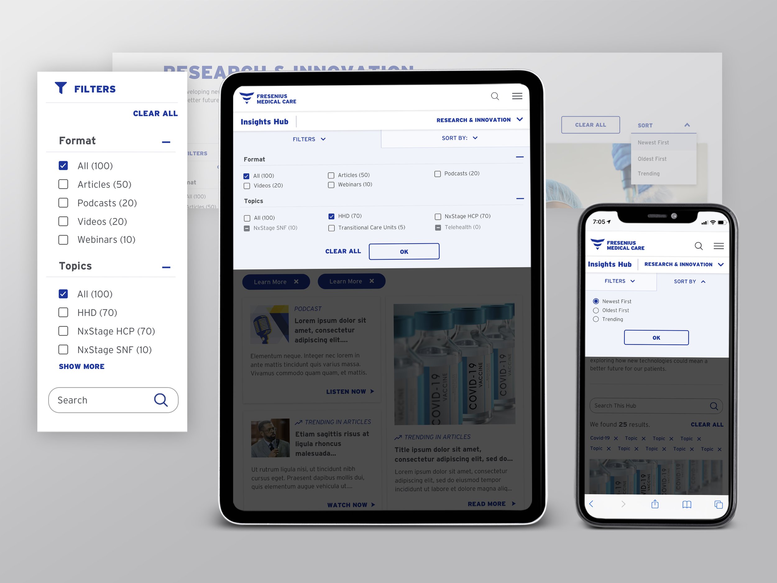
Figure 2. Filtering UI on desktop, tablet, and mobile
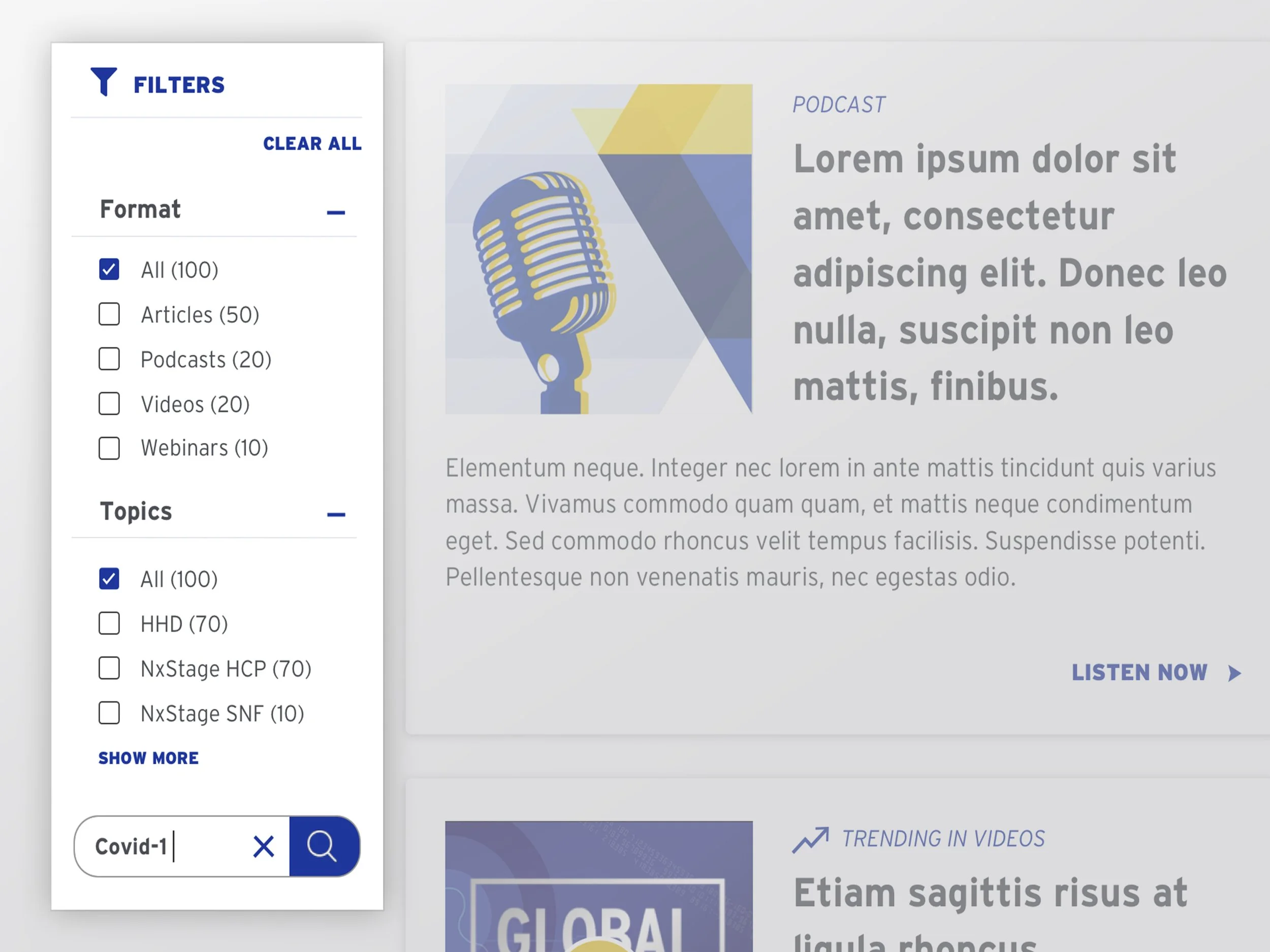
Figure 3. A Demonstration of search interactivity
As soon as the user begins to type, the outline around the search box and search term become darker, an "X" appears to clear a search, and the background behind the submit button turns blue as the magnifying glass turns white.
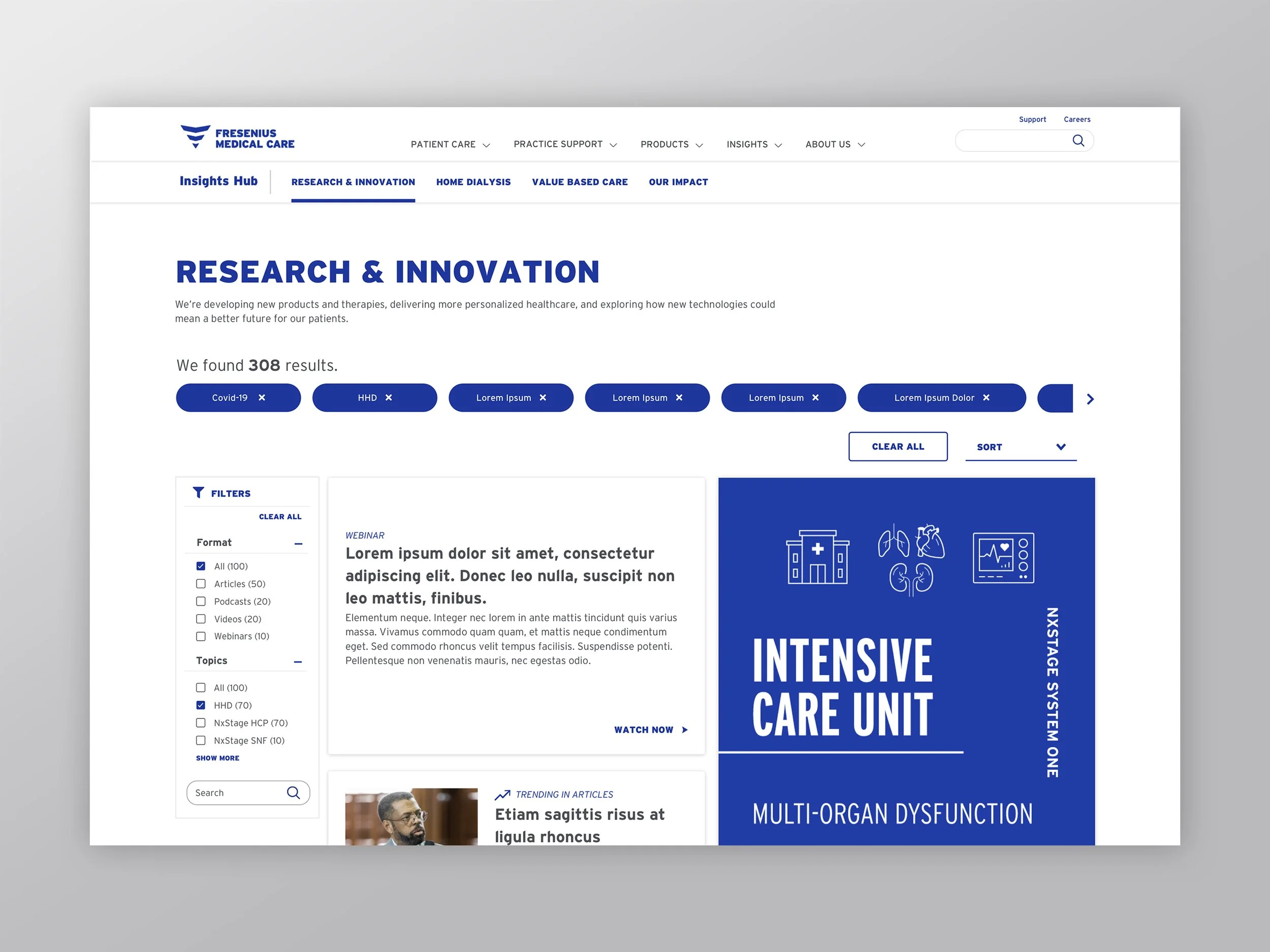
Figure 4. Additive search results in addition to pre-selected topics show up above the media cards and filtering menu.
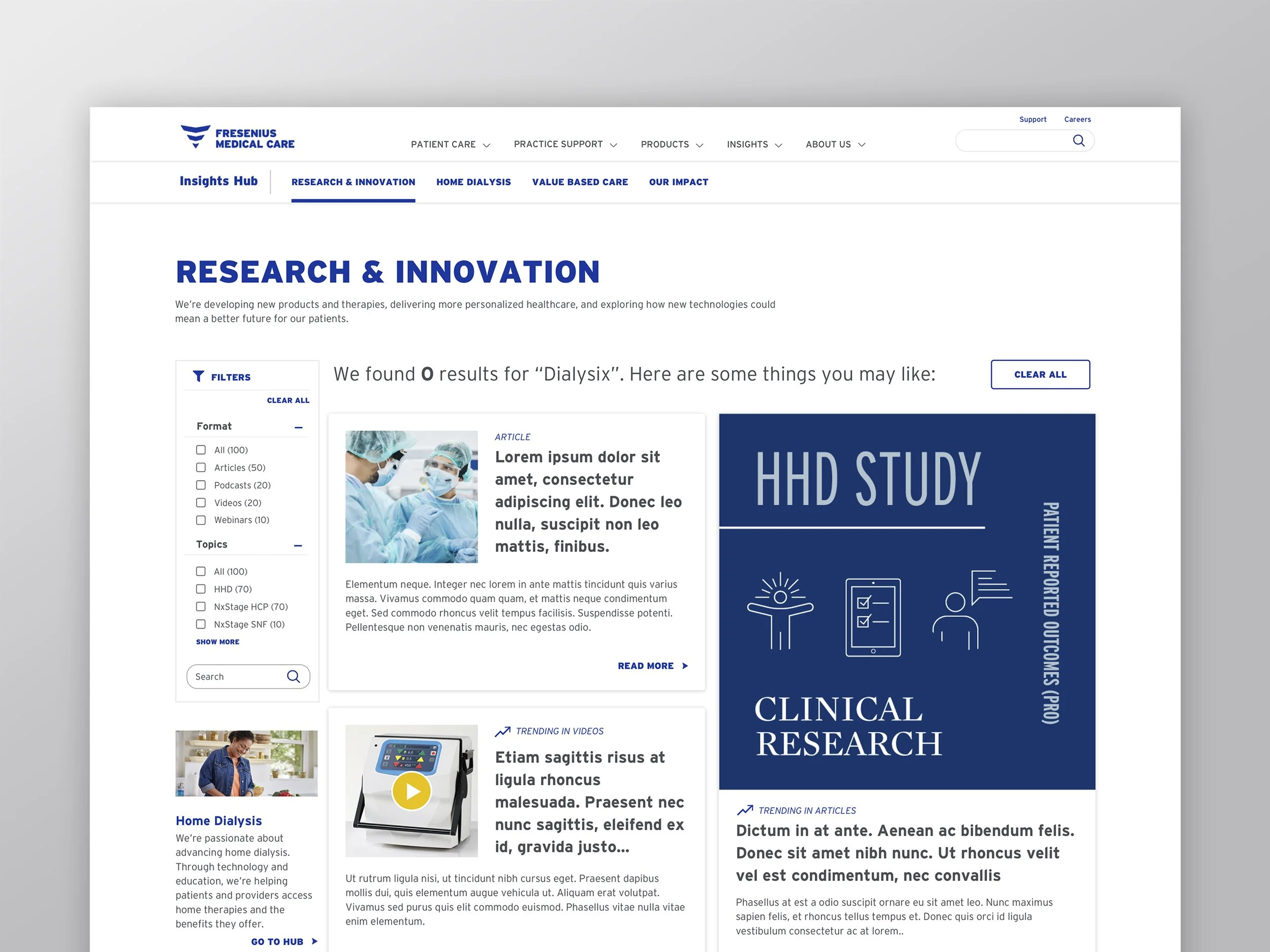
Figure 5. Zero Search Results Scenario
If users search for a term that is misspelled or doesn't exist, they will receive a message telling them so, along with content they may like. They then can click on "Clear All," which will reset the page results back to their default state.
Solution 3
The previous iteration of the insights hub was missing proper pagination. So, I gave it a facelift and added functionalities to accommodate user preference.
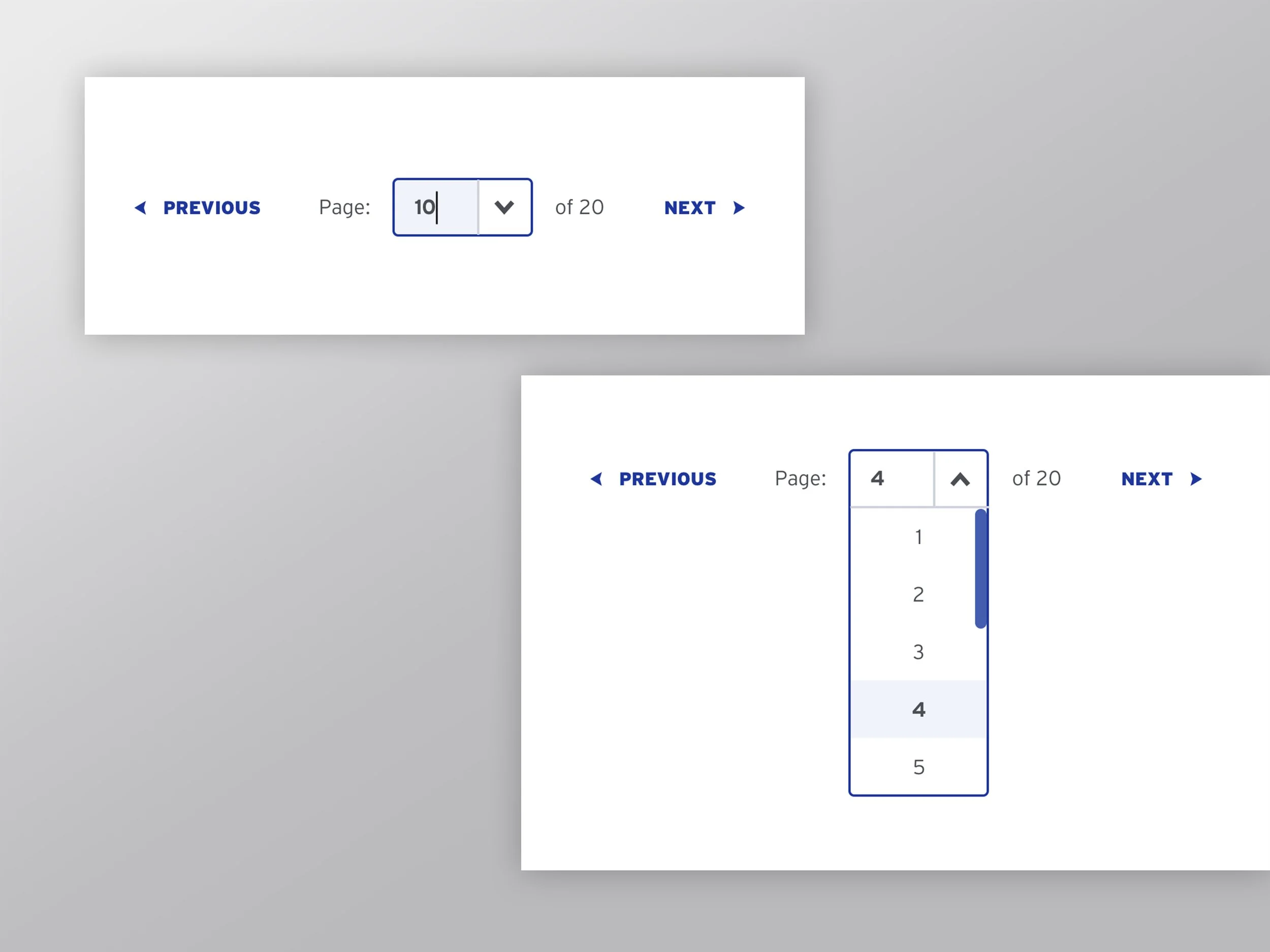
Figure 5. Additions I made to pagination
Providing the total amount of pages available - i.e., "1 of 20" - based on search and filtering terms. Previously this didn't exist, making it hard for the user to know how many available page results existed.
I added an option to type in the page number to jump to a page quickly and easily.
I added "Previous" and "Next" arrows to toggle through pages instead of having to click on the specific page number to get there.